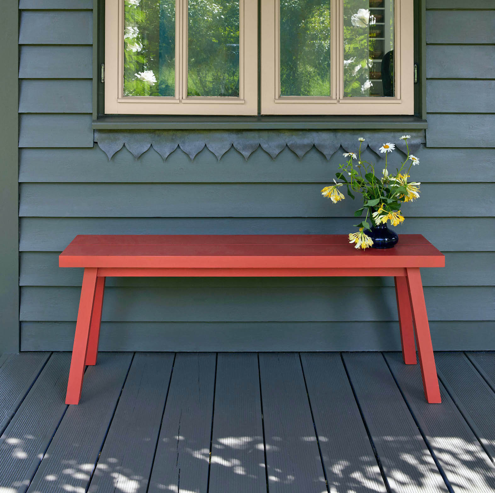
Gardener’s Dozen: Jinny Blom’s Outdoor (And Indoor) Paint Collection
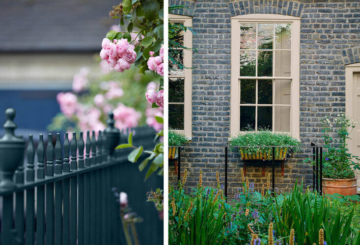
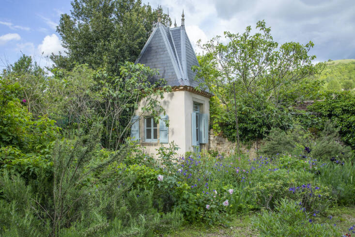
“White is not a good color in a garden,” says internationally-renowned landscape gardener Jinny Blom, whose paint range launches today. Over the last decade or so she has worked on developing colors that “read as white” when seen in a landscape—as well as better choices for railings than the usual black, and an accent red for furniture that is as beguiling as a Ladybird poppy. Her manufacturing partner, venerable London company Mylands, offers this collection in three water-based finishes: exterior masonry paint, marble matte emulsion (made with crushed marble), and a plant-based multi-surface paint (the latter in matte, eggshell, satin, and gloss). They are distributed in the US.
Photography by Britt Willoughby.
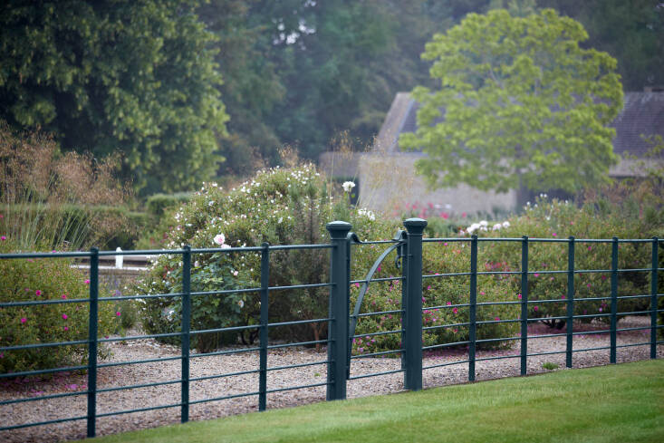
“Mylands has an exceptional understanding of color as a mood-altering background, so in that we share a common language,” writes Jinny in her recent book, What Makes a Garden. Railings are normally underplayed but since Jinny commissions miles of them, it stands to reason that she is as interested in the color of metalwork as she is bothered by something that is the wrong color. “If you ever want to know where color is going wrong in a garden, just take a load of snaps on your phone—it’ll jump out immediately.”
Mylands is the oldest family-owned paints and polishes manufacturer in the UK and has been quietly servicing the entertainment business and Buckingham Palace for decades. Its eco-credentials are excellent, although those are not widely broadcast either: Their intense hues are the result of earth pigments and natural resins, they are low in VOCs, and their paints are solvent-free.
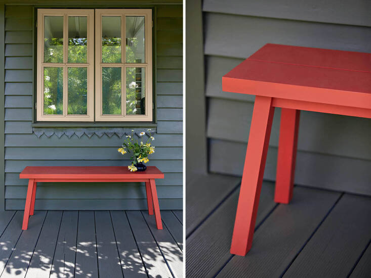
Jinny asked the artist Susan Hirsch to help her develop the colors she had in mind. The origin of Blomster red was an old faded chair that she’d noticed once, outside a house: “I recognized it again once she’d finished mixing.”
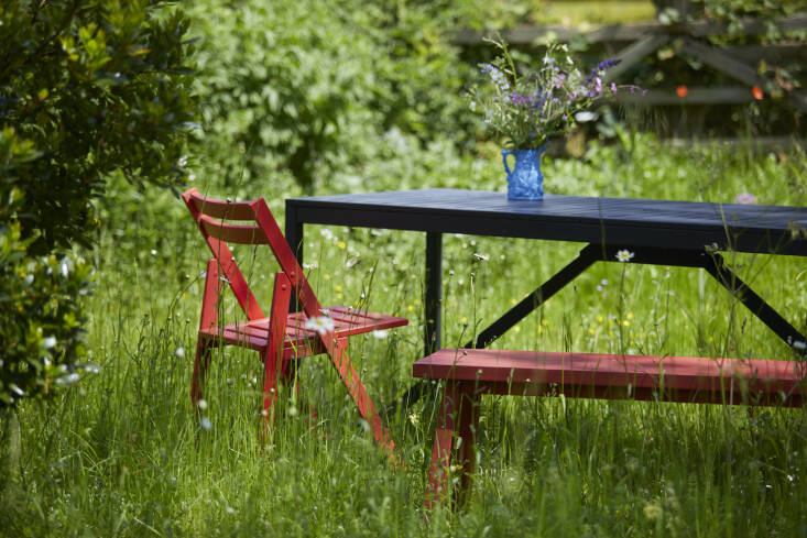
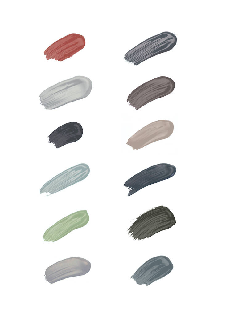
The five tones that Jinny developed to use in place of white are: Grail, Rain, Sprig, Sargasso, and Cooper’s Earth. “Natural light is very powerful and bleaches most colors, so don’t be afraid of experimenting with tones instead.”
For more on natural exterior stains and paints, see:
(Visited 1 times, 1 visits today)